Some CX suggestions for Carvana

Background
I've recently had to start commuting to work again for the first time in around ~5 years - I've been working remotely for the bulk of that time and prior to that I was lucky enough to walk to work for bit. I gave the Pittsburgh bus system a good college try for the last 3 months, and while it's certainly usable I decided to purchase a vehicle to commute instead because:
- Independence: I miss having the independence of dictating my own schedule - I'll often get focused on work at my desk, miss the time to leave to make my bus, have to wait for the next one, finish out my work thought, and then have too much time on my hands until the next bus but not enough time to get back into ~creative flow state~.
- Time: Commuting by bus takes a chunk of time out of my day, around 2-2.5 hours depending on how I manage my schedule wrt to the above.
- Convenience: It's a convenience which I am lucky/privileged enough to take the advantage of, and it feels worth it to me.
- Paper-cuts/whining: I experimented with taking transfers and I don't particularly enjoy the experience of waiting 20-30 minutes at a bus stop for the next bus, especially in the winter. The only direct route for me involves a 10-15 minute walk up a hill and then a 10 minute walk at the destination, which is honestly good for me but is still annoying. The route I take also has 2 sub-routes/different pickup points, in my early days of taking the bus I definitely went to the wrong stop and missed the bus, having to wait the 30-60 minutes for the next one. I've also had to deal with cancellations on the bus route due to construction, so lots of small things that make me want to change the situation.
How do I feel about Carvana?
I am overall a big fan of Carvana, having purchased our first vehicle from them in ~2020. I don't want to deal with dealers, I'm picky about my social interactions and I'd prefer to avoid out-of-band social interactions where possible, I don't want to take time out of my day to browse, set up the purchase, set up financing, deal with registering the vehicle and I like that I can see what the price will be all in so I don't have to worry about negotiating. There is more than likely a price increase built in to accommodate for all of these niceties but it is worth it for me in my situation and from my perspective.
This round of buying a vehicle from Carvana was no different, I really enjoyed the process and I felt all the benefits that I listed above. I like the service provided by Carvana, I recommend buying from them and this post is coming from a place of positivity with small CX improvements that I think would help further the experience for customers like myself.
The suggestions
Further reduce human intervention
One of the biggest draws to Carvana for me is being able to asynchronously buy a car. I can take my own time in researching, selecting the cars I'm interested in, and then going about the buying process on my own time - within reason, there are time limits enforced when you start the buying process but on the whole I'm in control. What is jarring for me after getting access to this level of convenience is being pulled into synchronous phone conversations with Carvana customer care representatives. I think we're guaranteed at least one call, even if everything is perfect and then many more calls if things aren't perfect. Then there's another call after the purchase is complete if you finance through Carvana/Bridgecrest to verify some information.
I would love if I had a checkbox at the start of the buying process that basically represented "I want no phone calls/I want to do everything through the app/email/text, even if that means potentially losing the sale". I imagine to make this a reality more tooling will likely need to be built but largely the "task completion" UI in the buying process feels pretty complete to be able to already do this. If Carvana already has a "convenience" pillar in their engineering/customer experience departments, zero phone calls would be a great goal to take - for customers like me.
Make saved searches more accessible
I like researching the things I buy, keeping my options open and having several different "threads" open in my head for the different possibilities. The saved searches feature is excellent for this and let's me hop between those open threads in my head to consider different options, I love it, big fan, almost every big app in this space has this nowadays. What I would love is if it was more convenient to get to the searches I've saved. Imagine me waking up at 3 AM like I do every night, I want to be able to quickly hop onto the app and load up a search to scratch that itch in my head, and hop between saved searches. Instead, what I have to do is
- Open the app
- Select the search bar
- Hit enter to start an empty search
- Hit the saved search button on the results screen
- Hit the view results button for one of my saved searches
This is what that looks like:
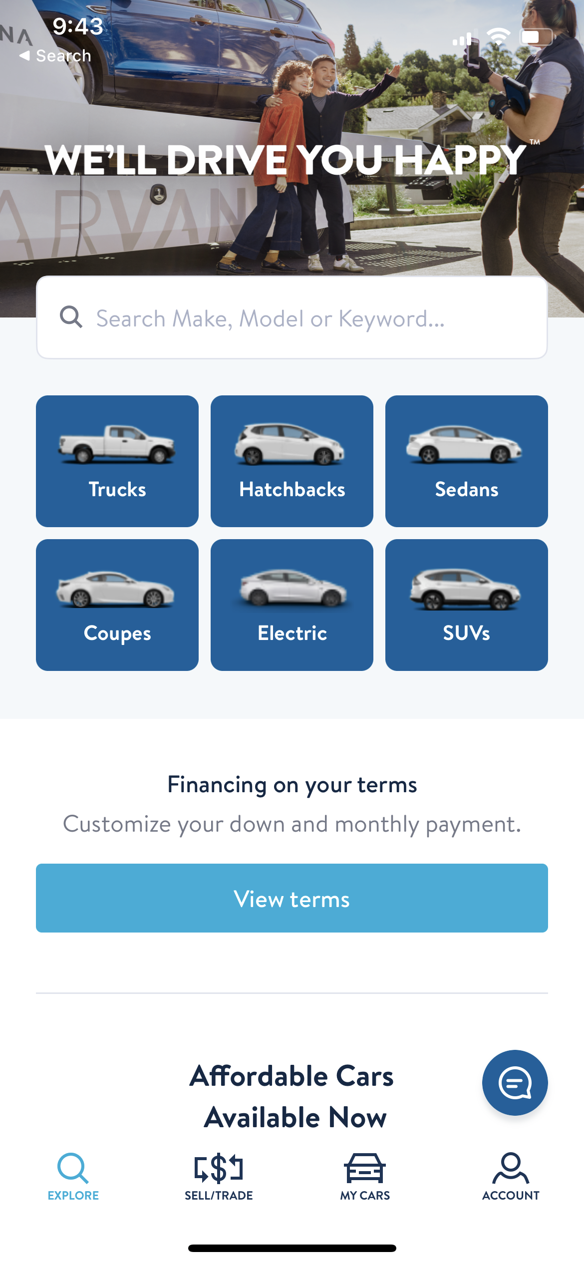
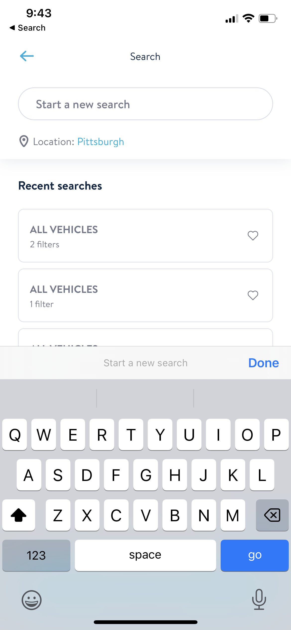
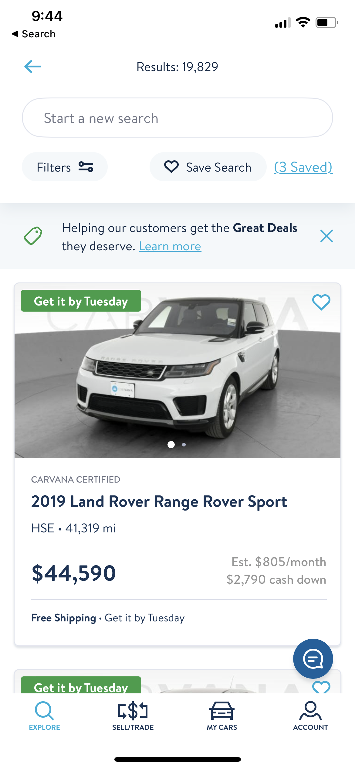
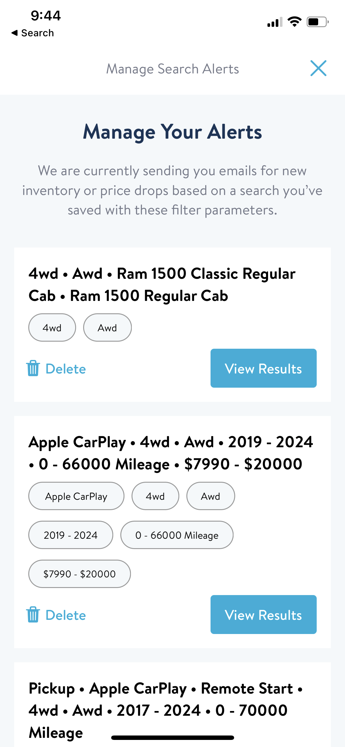
The efficiency hackers among you may point out that you can combine steps 2-3 by clicking on a body type on the home screen to start a search. Bravo.
What I would actually love is if the home screen had the same quick link to the "3 saved" searches button, so I could open the app and go to the saved searches screen. What I'd love even more is if I could open the app and I had a small section that just listed my saved searches and I could click in through the home screen on the saved search I wanted, taking me down from 5 actions to 2 actions(!!!).
Don't reorder my checkboxes :(
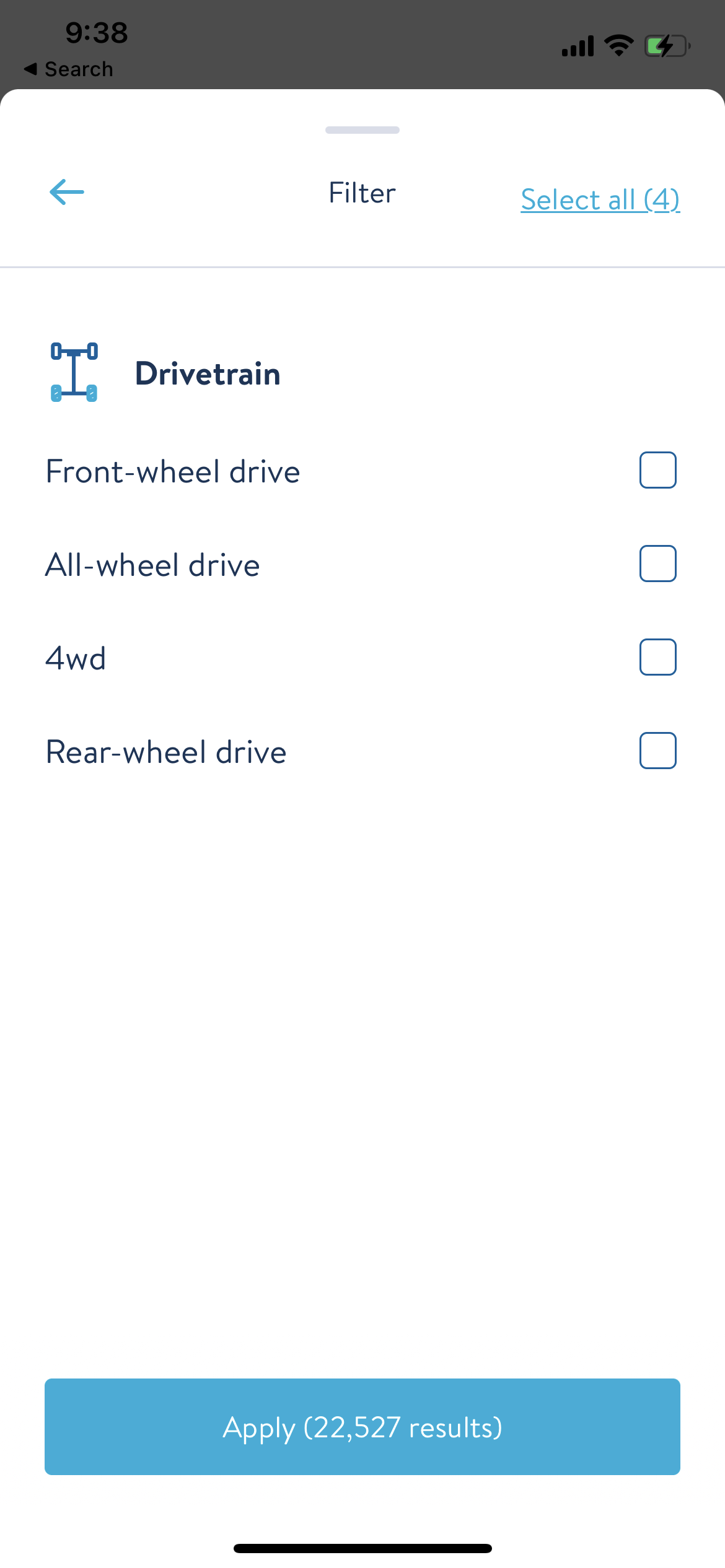
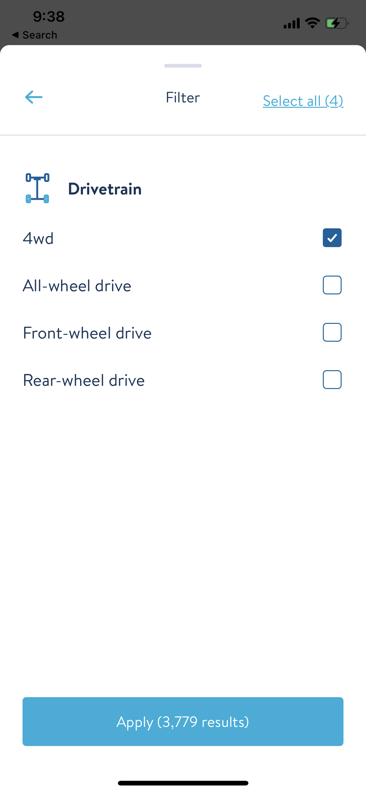
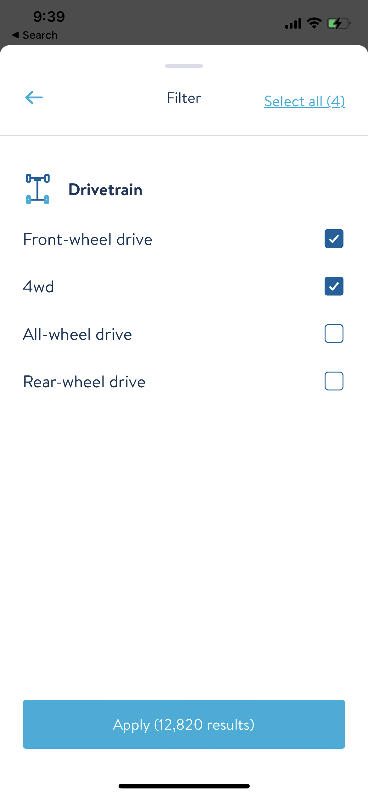
Carvana has a good set of filters in their search which I really appreciate, because it points to great data hygiene and classification on the side of the business that does the intake for the cars being listed. What I don't like is whenever I select any option in the filters, it reorders the list and puts my newest selected option up top, starting a search as soon as I select the option to show me the filtered set of results. This confuses me and a lot of the time I attempt to tap the checkbox again because I forget that a search has been started and by the time I tap again the search has finished and reordered my filter list, leading me to tap an option I didn't mean to tap.
What I would love in interfaces like this is a "freeze" (can show all boxes as disabled) on the UI to prevent interaction once a search has started and then an unfreeze once it's completed. And please do not reorder the checkboxes, I think it always leads to confusion.
Help me clean my history
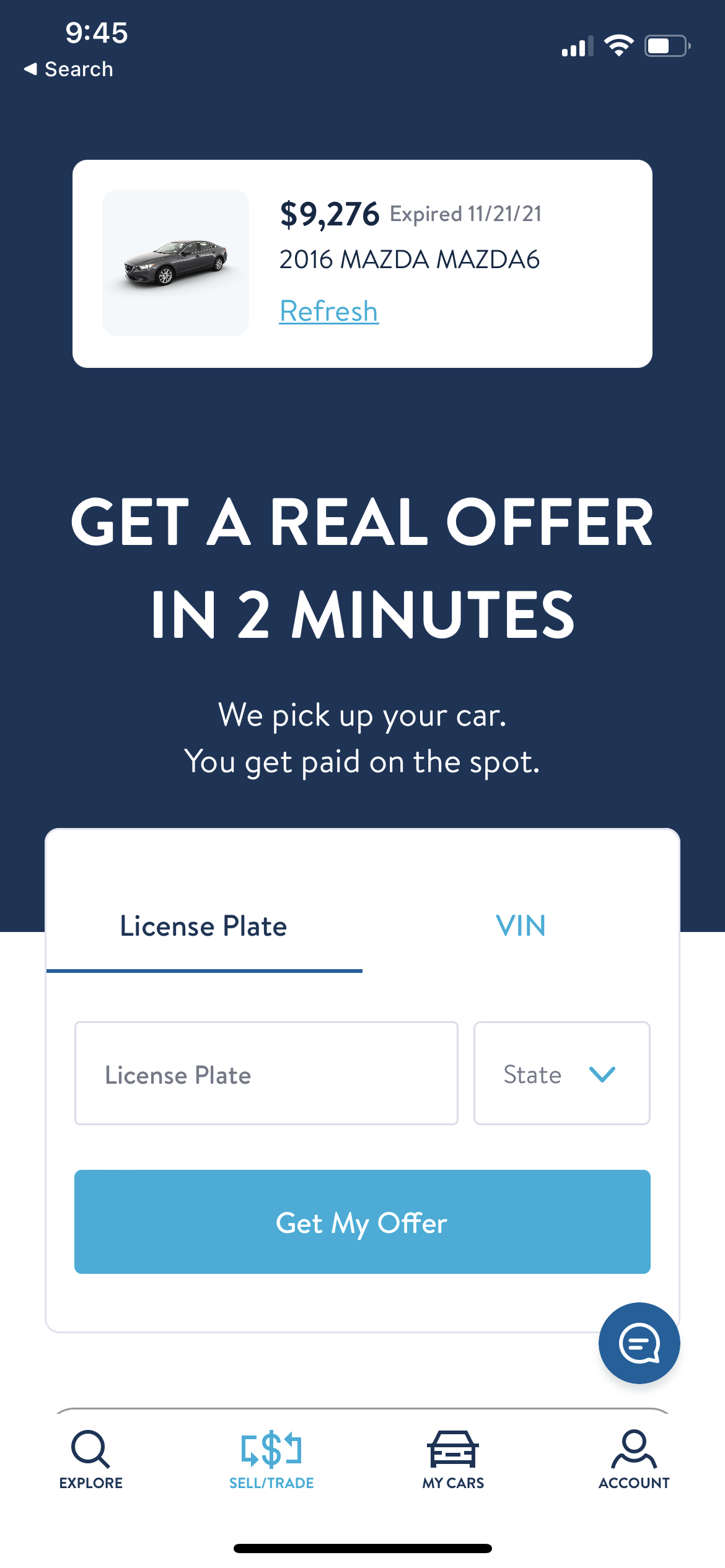
Back in 2019/2020 I purchased my first car from Carvana. I even traded in my existing car - a Mazda6 - to Carvana. The experience was smooth, effortless and great.
However, I still have an offer to trade in that Mazda6. I sold that car to Carvana. I no longer want to see this offer ever again. I cannot get rid of this offer through the app. I would love a button to get rid of my four year old offer for a car I no longer own.
Learn my history
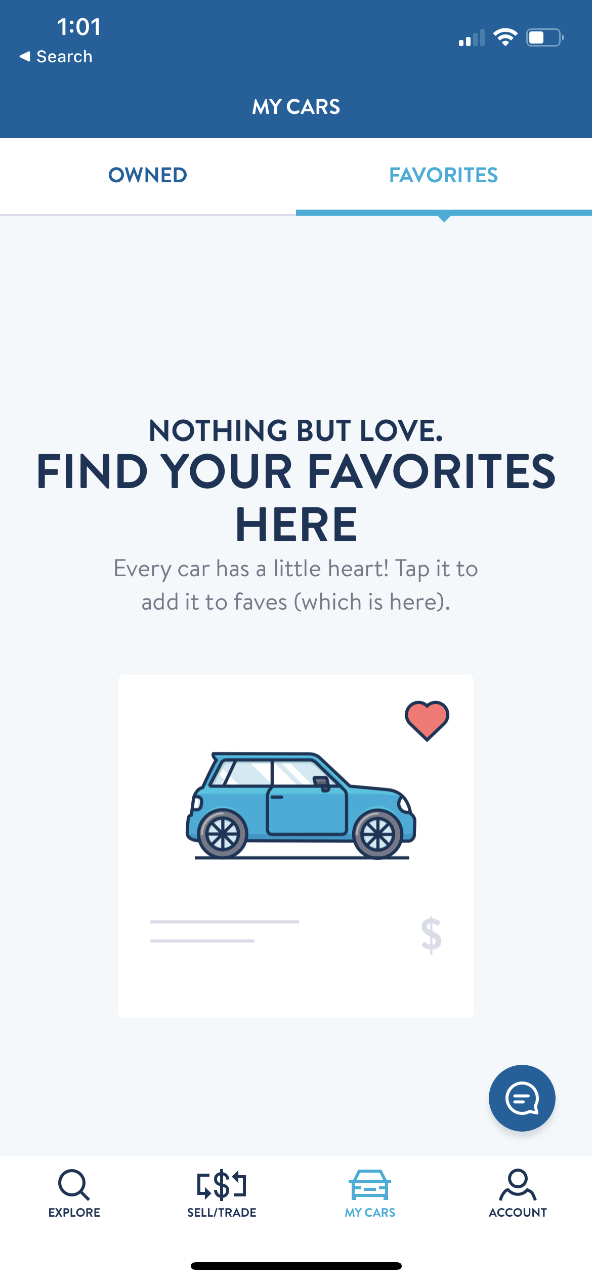
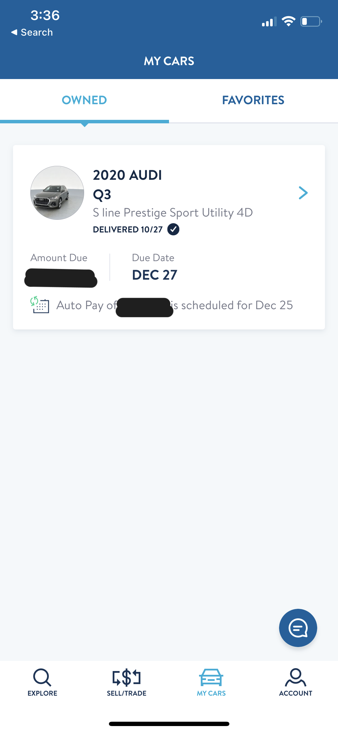
Both of the cars that we have bought from Carvana have been financed with Carvana/Bridgecrest. What's great about that is the loan information gets synced to your app and you can go to the My Cars tab -> Owned sub-tab and tap into the cars you own to see your loan details and other useful information. This is great. What's not great is every time I open the app fresh, I get defaulted to the "Favorites" sub-tab. That was fine when I was searching for cars, but now that I've purchased a car, I no longer have favorites. I then have to tap over to the "Owned" tab, another extra action that I don't want to take.
What I'd love here is for the app to just locally save the last sub-tab that I was on, so every time I reload the app and go to the My Cars tab, will put me in the correct sub-tab.
Investigate de-sync
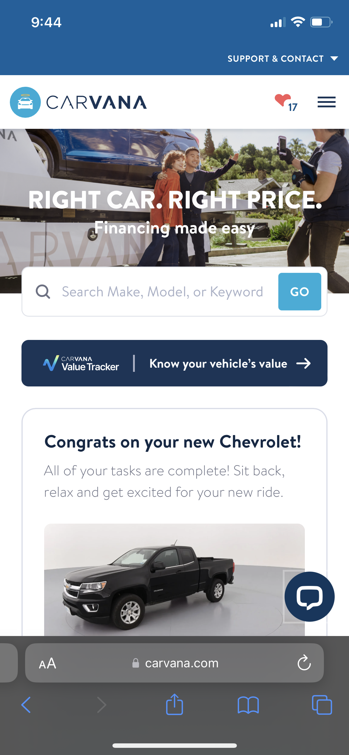
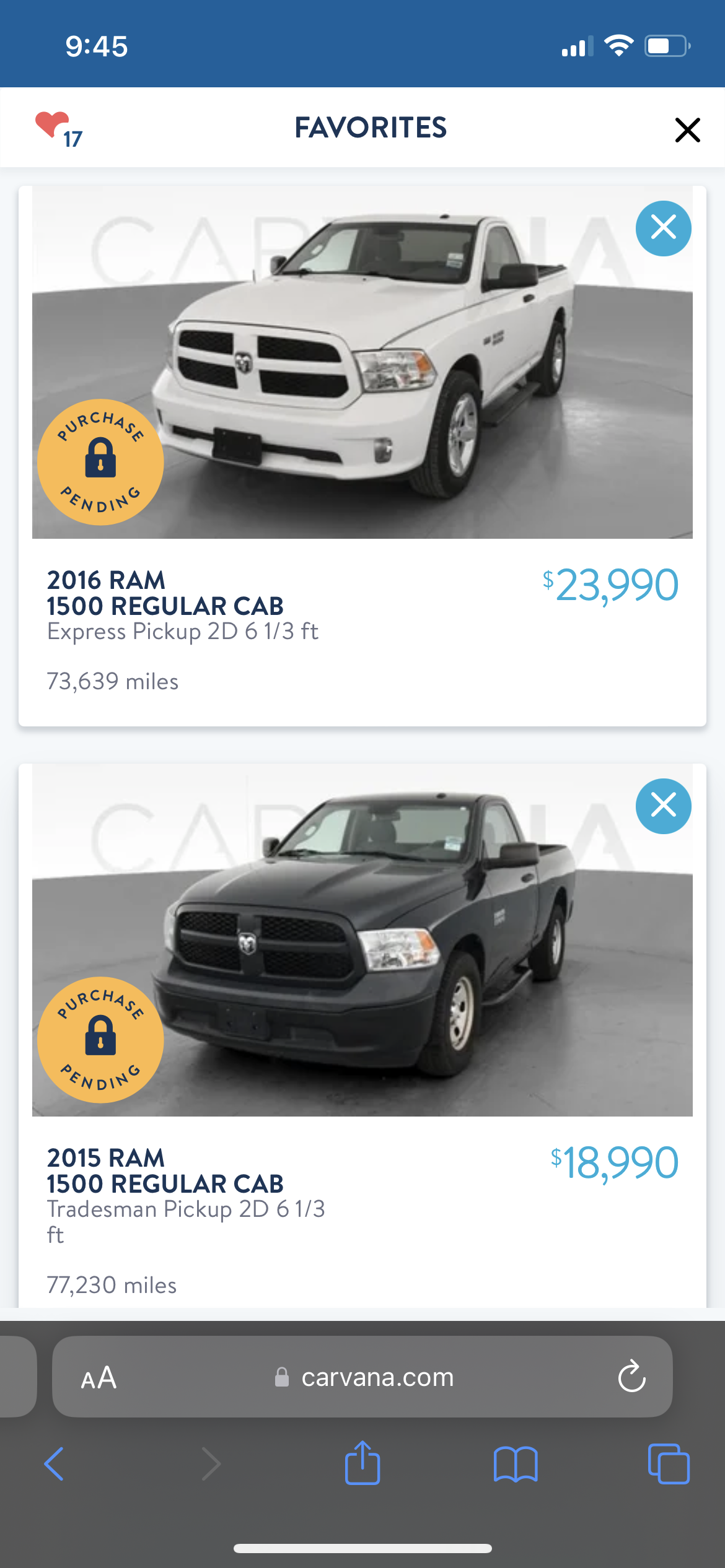
At some point in the buying process I had to hop onto the mobile app for some reason (maybe a link and not a deep-link sent through email) and something interesting/confusing I found was that there was some desync between my "favorites" list on the app (empty) and my favorites list via the web browser (17). This is probably the least important point on this list but I just have a feeling deep down that a dev specifically explained this to their manager but it was deemed fine and now it annoys me and I hope the dev feels vindicated if this made up scenario is real.

Increase filterability
Alright so I love the filtering that already exists to allow searching for things that I want but I'd love it if Carvana did some experimenting here and introduced some new paradigms. Before I give suggestions here, I want to recognize that the search filters UI today feels very clean and smooth and these suggestions could lead to things looking much uglier. With that out of the way, here are 3 things that could take search to another level for customers like me:
Even more data classification
The car I was looking to purchase was actually a truck. This was my first truck purchase and I was specifically looking for either a regular cab or extended cab, with a 6-ish foot bed (not too short, not too long). However Carvana does not provide cab-type or bed-size filters. I would love for this and all other kinds of information to be cataloged and made available for search. Maybe an opportunity to jump onto the AI hype and build something that can do this part much better than humans can.
And/Or searching
This is something I haven't seen so far in apps in this space, but I think it would be really cool to have And/Or grouping of search terms. For me, 4wd/AWD, low mileage and under a certain dollar amount were a must. On top of that I really wanted Apple CarPlay, remote start, heated seats and a heated steering wheel. I only got 2 out of the last 4. I would have loved to be able to say (4wd/AWD AND low mileage AND under a certain dollar amount) AND (Apple CarPlay OR remote start OR heated seats OR a heated steering wheel). This would let me look at the whole pool of possibilities, instead of having to back up, start a new search, then another and another and manually keep track via favorites of the cars that interested me.
Sort by this, then that
The search results have a Sort option, allowing you to sort by things like Recommended, Newest Inventory, Price (high), Price (low) and more. What I would love is if I could specify that I want to sort by Price (low to high), then by lowest mileage, and then by newest year. What I'd then love to see is maybe results in "bands" showing me results with prices in a $5,000-$10,000 tranche, inside that showing me tranches of mileage in buckets determined by the algorithm and then buckets inside that by years. Yeah, this would look extremely complicated probably and your average customer might not find it useful, but I just think it's a neat idea, even if it's a swing and a miss.
Conclusion
I'll probably be purchasing another vehicle from Carvana at some point in my life, regardless of them making any of improvements in their CX, their service is great as it is today and maybe that's reason enough not to invest in features like the ones I've listed above. I get it. Businesses be businessing. All of the things above just itched a part of my brain enough that I wanted to get them all out by writing them down.
